Space-saving design

The SLEEPBOX is a concept that has been designed in order to make travelling more pleasurable. It is intended to be placed in airports in order to provide a place for weary travellers to sleep between flights.

It is basically a box with bunk beds inside. This provides privacy for the user but also has some clever space saving ideas, including a desk that folds out from the wall – in a similar way to the tray o the seats of an aeroplane. The use of bunk beds means that more can be placed in a smaller space.

This is a beautifully simple example of space-saving design. I can certainly see this idea catching on quite quickly.

20140303-203814.jpg

20140303-204241.jpg

20140303-204300.jpg

20140303-205849.jpg

Olympic Park, Stratford – visualisations of the final outcome

Stratford has recently undergone a dramatic redevelopment as it hosted the London 2012 Olympics. This short video shows the new landscape and how the image of the area has changed significantly as a result.

Preparing Stratford for the Olympics – The Stratford Shoal by Studio Egret West

Studio Egret West are the company responsible for what has become one of Stratford’s most recognisable landmarks.  This is what they had to say about the project:

Image

The Stratford Shoal

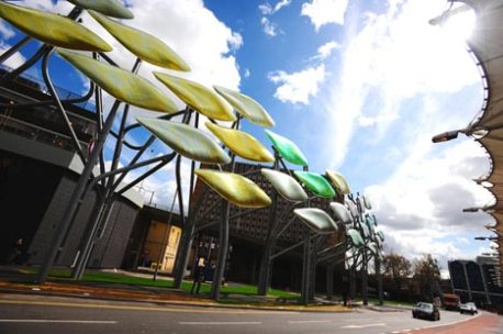
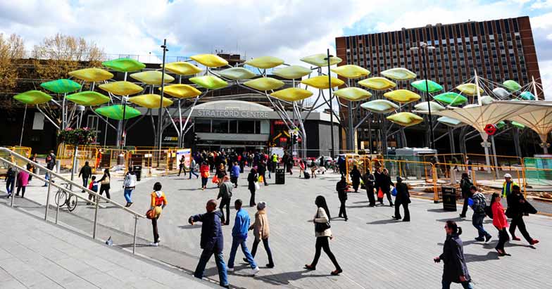
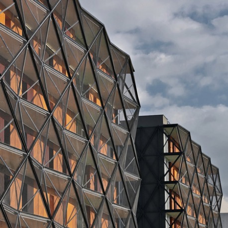
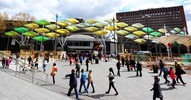
Studio Egret West is delighted to announce the completion of ‘The Stratford Shoal’, a 250m titanium sculpture in Stratford, London.

The Shoal is a public realm intervention, which aims to improve the urban continuity and legibility of the existing 1970’s Stratford Centre. In the 70’s, the Stratford Centre was created with a positive frontage to the existing high street to it’s south. With the introduction of the Stratford bus interchange, and later, the refurbishment of Stratford Station to the north, the ‘back’ of the centre, with its delivery bays and car parking ramps, became much more visibly public. Recently, the Olympic Park and the Westfield Centre entrances have been established to the north meaning that the ‘back’ has very much become the front: the entrance to Stratford.

In 2009 a competition was established by London Borough of Newham to suggest a solution to this complex urban problem, which was won by Studio Egret West.

Studio Egret West responded to Newham’s desire to emphasise the Stratford Centre entrance with a bold and innovative approach.

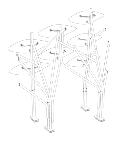
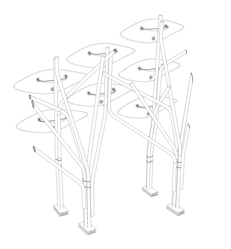
A series of curvaceous and branch-like steel ‘trees’ are arranged with a trellis like array of support points. On these are fixed giant leaf shapes of titanium that glisten in the light and are able to move in the wind. Early on, an option to intensively plant mature trees around the sites edge was investigated, but was not pursued due to the myriad of vital services running beneath the existing pavement.

The surface of giant ‘leaves’ mimics the scale and rhythm of the existing trees and re-establishes the urban continuity of the site. They rise and deform, to mark and celebrate the entrance to the Stratford Centre and continue on, beyond, to the old high street. They are an indicator that Stratford is not just the home of the Olympics and has a much broader offer.

The leaves also provide a screen for the assortment of Stratford Centre buildings behind. Rather than hiding this elevation behind, the leaves act to enliven it, divert attention from it and playfully raise the spirits of its onlookers, rising and falling with the choreographic elegance of a shoal of fish.

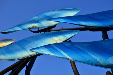
With the view of semi-permanency rather than a temporary intervention, a light and durable material was sought for the leaves. Titanium offered both durability and lightness and held the additional trump card of being able to alter its colour through anodising.

The Shoal uses the breadth of this technology to adjust its tone dependant on location with the leaves shifting from warm reds near the cultural quarter, bright yellows and gold’s around the main entrance to the Stratford Centre and pedestrian crossing; and blue tones which compliment the green hues of the existing trees.

The Stratford Centre has now started a process of reinvention and transformation, and will radically change over the coming 30 years. The Shoal allows the emerging plans for Stratford to take shape with a new titanium veil in the foreground, like a grandiose shimmering palisade, the Shoal plays a positive role in anchoring this place as it re-emerges confidently after the Olympics.
Sir Robin Wales, Mayor of Newham said:

“Newham is undergoing unprecedented transformation, nowhere more so than in Stratford. The Shoal is part of the £13.5 million high quality public realm project to improve Stratford Town Centre for residents and businesses and offer a unique visitor experience.

With the emergence of the Olympic Park and Westfield Stratford City, the Shoal will connect Stratford’s exciting new developments with the existing thriving town centre and cultural quarter, helping to position the area as a world leading business, leisure and tourism destination.”

David West, Studio Egret West said:

“The Shoal was born of a desire to turn a negative into a positive. Instead of screening the back of house of the Stratford shopping centre, which now finds itself in the foreground, we have created a playful and dynamic edge that brings a moment of delight to those arriving in Newham. We specifically used titanium because of its range of colours and its shimmering quality, meaning that the Shoal’s appearance constantly changes in response to varying light conditions”.

Technical Information

The Shoal was designed and manufacturered utilising the latest 3D technology, harnessing Rhino and 3D Microstation for it’s design and using CAD CAM technology for rapid prototyping and the manufacturer of it’s GRP leaves. The project’s use of BIM allowed the design team, with Studio Egret West as Architects and Packman Lucas as Engineer’s, to converse fluently with the contractor on the complex steelwork structure as well as the undulating and complex amorphous forms of the leaves. The computer model was not just used to build the forms but was also critical in testing motion, the leaves centre of gravity and the laying of the leaves single curved titanium strips over their double curved surface.

The 3D CAD model was central to the design and manufacturing process, used from the project’s inception as an iterative architectural and structural 3D design tool and evolving into a contractual ‘document’ used for production information, cost management and construction.

In tandem with this computer aided process was a much more ‘hand made’ approach. Prototyping the leaves at various scales, a number of times to test if the computer models were producing the correct ‘real-life’ results.

The steelwork was conceived as a series of treelike branches budding from a cluster or trunk, fabricated from a fixed number of radii and straight elements to create a modular set of repeatable components, which would appear to be completely random. The computer gave the designers many economies in fabrication and simplified the manufacturing process. The trunks were welded to form rigid composite elements and branches were fixed as they touched to add stability and to prevent buckling; in many ways behaving in a similar fashion to the structure of a tree.

Below ground are large complex base elements, comprised of composite steel I-beams and flats which reduce the moment forces of the trunks as they are transferred into their foundations. These elements had to work especially hard to make up for the foundations not being situated in their ideal positions but being defined instead by the myriad of underground services running below the pavement.

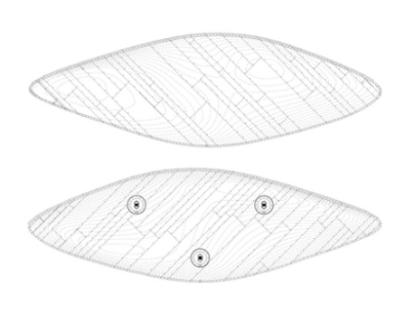
From the steelwork frame ‘bull-horn’ arms extend, each supporting one of 73 titanium clad GRP leaves. These arms are like wishbones, which connect the frame to the leaves and are intended to be as slim and elegant as possible, slimming to just 40mm where they penetrate into the rear of the leaves.
The leaves are manufactured from a thin GRP inner shell over a plywood structural frame, made from three moulds to give three varying forms, this strengthens the overall reading of the leaves as one surface. The leaf arms are fixed into the plywood frames with a hook detail allowing the leaves to be easily installed. At the end of this hook is a specialist bearing, which gives the leaves horizontal tolerance, ensuring they can hang freely. At the junction of the leaf arms is a rigid moulded plastic cowl (brightly coloured) and a soft rubber gaiter (similar to the leather gear stick gaiters found in cars). Again, all of these components were designed and manufactured directly from 3D CAD information.

It was critical from the outset of the project that the leaves had a hand made and crafted quality. Through prototyping a manufacturing process was developed which would deliver the qualities sought.

By testing fabrication methods the designers determined a specific laying pattern for the titanium strips on each of the leaves (placing thinner and shorter strips in areas of greater curvature and placing darker shades of colour in the deeper areas to further extend the sense of curvature).

By cladding the leaves in anodised titanium strips, the designers were able to optimise the effect of the leaves movement. Using an opalescent material to enhance the shimmering quality of the sculpture. Each titanium strip on each leaf was given an individual code, ensuring that each of the leaves was individual in pattern and colour.

At the rear of each leaf is a bi-directional damping mechanism, fixed to the leaves with a bespoke 3-dimensional bearing. The dampers allow the leaf’s to move for a limited range of motion and damp the movement as the forces, caused by the wind, increase. This collection of dampers, springs and bearings is designed to be dynamic, meaning that the greater the winds force the greater the dampers response.

ImageImageImageImageImage

Basket apartments by OFIS Arhitekti

This student housing building in Paris by Slovenian studio OFIS Arhitekti was designed to resembled a stack of wooden baskets.  “Our concept was of spinning and rotating baskets,” architect Rok Oman explains.  He wanted to avoid creating a “predefined” linear building.

Located between a football pitch and a tram route, Basket Apartments comprises two ten-storey blocks and every ‘basket’ is a cluster of rooms that each have their own private balconies.

Despite the irregular facade, each study bedroom is exactly the same size and has an identical layout.  Open-air corridors run along the rear elevation of the building and are contained behind a tessellated mesh screen. The architects explain how they intended these galleries as an “open common space for students”.  A bridge connects the two blocks at second floor level and oversails a small garden in the space between.

ImageImageImageImageImageImageImageImageImage

Scape student housing by Ab Rogers Design

Dezeen_Scape-by-Ab-Rogers_23Scape student housing by Ab Rogers DesignDezeen_Scape-by-Ab-Rogers_15Dezeen_Scape-by-Ab-Rogers_14Dezeen_Scape-by-Ab-Rogers_2Dezeen_Scape-by-Ab-Rogers_6

Scape is a housing block for 600 students in London’s East End and contains study bedrooms that are no more than 12.5 square metres in area. Inspired by sleeping quarters in train carriages, the rooms feature space-saving measures such as cupboards that double up as desks and seating in the windows.

Ab Rogers says his vision was to “create a forward-thinking design language for small spaces that would appeal to a young target audience and be able to be reapplied in other environments”.

Corian surfaces give each room a clean white aesthetic, plus each one includes brightly coloured furnishings in one of six vivid shades.

“For the Scape project, we started with the rooms, which are highly engineered pieces of industrial design given a domestic veneer,” said Rogers. “Each is an individual pod, made off site.”

Block colours also aid orientation through the building, as a bright red staircase spirals up from the reception to floors that are each labelled with a different colour.

“The common parts needed to support a complicated social infrastructure for socialising, study and care for hundreds of young people,” added Rogers. “Dynamic integral wayfinding systems and vibrant colour codings knit the buildings’ internal parts together, while the individual rooms offer complete calm for every occupant.”

The accommodation is accompanied by two restaurants; a cafe named The Kitchen and a Pan-Asian restaurant entitled Box Noodle. Students can either dine inside, or order takeaway to eat in their rooms.

Scape welcomed its first occupants in September 2012.

Tiny Madrid Appartment


A prototype unit will be open to the public at Virserum Art Museum in Småland (the Swedish province, not the crèche/ball pit hellhole found at a certain Swedish furniture retailer) as part of a special exhibition on, you guessed it, wood. The exhibition runs through December 8.

Speaking to Gizmag, Tengbom’s Karin Bodin hints that while the smart units – an “attractive alernative” to traditional student housing — are strictly a student-affair at the moment, other uses are possible: ” … with small changes it can be used as a guest house, office or hotel room,” she says.

100m3 apartment: This singular urban shelter is just twenty square metres and nevertheless is one hundred cubic metres of volume. In such an enclosed space should a single person live and work. He will use his creativity and dynamism to make it his own sweet home.

A longitudinal section defines the project. The space highness has been used to accommodate several pieces, which are limited in volume but at the same time all are visually connected to each other. Even the bathroom is within sight.

The necessity to hold the programmed uses, each of them with specific characteristics and size, leads to an image which looks like those old computers platform games. The idea of light and simple floors where could be possible even easily jump from one to another was always in mind from the very first sketches.

Size, both horizontal and vertical, of every piece gives as a result a non lineal path. So, moving from one room to another is a kind of small physical effort.

Going up to the kitchen or getting down to the bedroom offers a stressed change and different sensation of the space, both any different unit and the apartment as a whole.

The apartment, even with its small size, wants to offer generous spaces and a big quantity of different pieces of use. The pieces that make it up, does not really have a fixed clearly defined use: the kitchen is a walk-through room to get the living. There are stands rather than stairs to go down the living, which is over a cellar-storage room. Then, it is possible to get the ladder to go up to the indoor sunny terrace, a place to be used as a study or a chill out. Also the central living room connects through four steps to the bathroom. This is an oversized kind of luxury room that holds even an in-situ cosy kind of hamman bath.

Construction and finishing are made in a direct and unadorned way and all is full of bright white.

Smart Student Units (2013) – Tengbom

Smart Student Unit

As college students across the country settle into their charmingly decorated holding pens dorm rooms, here’s a quick look at an on-campus housing option that will be available to students enrolled at Lund University in southern Sweden when the 2014 academic year rolls around.

Designed by lauded Swedish architectural firm Tengbum in collaboration with wood purveyor Martinsons, real estate company AF Bostäder, and current students from Lund University, “Smart Student Units” are freestanding wooden dwellings with a decidedly petite footprint of a mere 108 square feet. Not exactly palatial, yes, but the units, which received legal consent to drop below the 269 square feet (10 square meters) required by Swedish building code for habitable spaces, manage to squeeze a whole lot in — an elevated sleeping loft, kitchenette, bathroom, dining area, and small back garden/patio — without seeming cramped or dungeon-like thanks to plenty of natural light and multipurpose design features including shelves that double as steps to the loft and a dining table/desk that functions as window shutter.

While clever design tricks makes the most efficient use of a minimal amount of space, the units are probably not the best location for a post-finals rager with 20 of your favorite classmates. However, as a comfortable and quiet place to study, snack, and sleep, you couldn’t really ask for much more. Plus, there’s the added bonus of not having to share space with potentially sociopathic and/or slovenly roommates or having to waddle down the hall in flip-flops to use the facilities. The cost, 50 percent less than student housing rates, leaves plenty of cash leftover for textbooks, instant ramen, and six-packs of Sofiero lager.

Tengbom explains the motivation for the heavy use of timber: Through an efficient layout and the use of cross laminated wood as a construction material the rent is reduced by 50% and the ecological impact and carbon footprints is also significantly reduced. Energy efficiency is a key issue when designing new buildings. Choosing right material and manufacturing methods is vital to minimize the carbon emission and therefore wood was chosen for its carbon positive qualities, and as a renewable resource it can be sourced locally to minimize transportation. The manufacturer method was chosen because of is flexible production and for its assembling technique which can be done on site to reduce construction time.

In total, 22 of these smart wooden huts will be constructed and become available to a lucky group of Lund University students. One would hope that the exteriors of each will be outfitted with some type of distinguishing feature so that exhausted undergrads don’t accidentally stumble into the wrong unit at the end of a long day.


Nakagin Capsule Tower (1972) – Kisho Kurokawa

Nakagin Capsule


Architect Kisho Kurokawa was very innovative in his creation of the Nakagin Capsule Tower in 1972, which was the first capsule architecture design. The module was created with the intention of housing traveling businessmen that worked in central Tokyo during the week. It is a prototype for architecture of sustainability and recycleability, as each module can be plugged in to the central core and replaced or exchanged when necessary.

Built in the Ginza area of Tokyo, a total of 140 capsules are stacked and rotated at varying angles around a central core, standing 14-stories high. The technology developed by Kurokawa allowed each unit to be installed to the concrete core with only 4 high-tension bolts, which keeps the units replaceable. Each capsule measures 4 x 2.5 meters, permitting enough room for one person to live comfortably. The interior space of each module can be manipulated by connecting the capsule to other capsules.

All pieces of the pods were manufactured in a factory in Shiga Prefecture then transported to the site by truck. The pre-assembled interior features a circular window, built-in bed and bathroom, and is furnished with a TV, radio and alarm clock. Hoisted by a crane, the capsules were inserted in the shipping containers by use of a crane, and then fastened to the concrete core shaft.

This unique take on apartments and high-rises in Tokyo is a prime example of the Metabolism architecture movement of Kisho, known for it’s focus on adaptable, growing and interchangeable building designs. These ideas first surfaced in 1960 at the “World Design Conference.” Hidaka once stated that the Metabolist ideas of the 1960s “were very new, the saw cities as ‘moving’ and dynamic, that concept is real. Metabolism wanted to collaborate with engineers, they invited scientists, designers, and industrial designers. THey wanted transcultural collaborations. It’s still relevant because of the ‘dynamic city’ and trans-cultural aspects.”

Another theme of the temporality of the Nakagin Capsule Tower is grounded in what Kurokawa observed throughout Japanese history; that Japanese cities built from natural materials had temporary and unpredictable lifespans. This hasn’t withstood the test of time, and the limits can be seen in the Nakagin Tower. “The tower had a design period of only four months- shorter than usual, and it was rushed. The designing went on even after construction had already started.”

Residents of the tiny pods are now plotting its demolition; although the capsules were built to be replacable, the building has not been maintained in over 33 years which has led to drainage and damaged water pipes. Architects from around the world are trying to work together to preserve the towers, considering all ideas and options.

Diogene House (2013) – Renzo Piano

Diogene House By Renzo Piano


Diogene is not an emergency accommodation, but a voluntary place of retreat. It is supposed to function in various climate conditions, independent of the existing infrastructure, i.e. as a self-sufficient system. The required water is collected by the house itself, cleaned and reused. The house supplies its own power and the necessary platform is minimised. We live in an age in which the demand for sustainability forces us to minimise our ecological footprint. This postulate is paired with the desire to concentrate and reduce the direct living environment to the truly essential things. Diogene might remind one of Henry D. Thoreau, who wrote the following in his book “Walden/Life in the Woods” in 1854: “I went to the woods because I wished to live deliberately, to front only the essential facts of life, and see if I could not learn what it had to teach.” It is no coincidence that Piano also regards his project as “quite romantic” and emphasises the aspect of “spiritual silence” which it conveys: “Diogene provides you with what you really need and no more.”

It can serve as a little weekend house, as a “studiolo”, as a small office. It can be placed freely in nature, but also right next to one’s workplace, or even as a simplified version in the middle of an open space office. However, it is also conceivable to erect groups of houses, e.g. as an informal hotel or guest house. Diogene is so small that it functions as the ideal retreat, but purposely does not cater for all needs to the same extent. Communication, for instance, will take place elsewhere – and thus Diogene also invites you to redefine the relationship between the individual and society.

Clever containers for students in South Africa

The property developers Citiq in Johannesburg, South Africa has built the student development called Mill Junction in Johannesburg as a result of trying to address the shortage of student accommodation in the city.

The architects have used shipping container to create affordable student accommodation, these have been built on top of empty, unused grain silos. In addition to the 375 individual apartments that have been built in the containers there will also be libraries, lounges, gyms and a rooftop terrace with amazing views of the city.

Image

Image

Image